7DRL Day 2: The Cosmetic Rut
Perhaps any day is a good day for game development for a hardcore game developer. Admittedly, I'm not a very hardcore game developer. As it happens, I managed to give myself a lovely neck cramp around 1 am, and this sabotaged a lot of my sleep. I attempted to balance an oversized icepack on my neck for most of the day and took over-the-counter anti-inflammatory meds for it. But it's been a distraction. I guess there's no such thing as a drama-free week.
Nevertheless, I pulled another solid eight pomodoros worth of development today on my 7DRL, Leerie. But most of it turned out to be waffling on an old point for me: the cosmetics.
It's an easy sticking point for any game project because how a game looks is a communication component for how it plays. It also flavors how players will think about it. The choice of cosmetics is an important decision! The only trouble is, it might not be a decision I'm ready for yet! I've had many past experiences with projects where I never escaped the cosmetic rut, often partly caused by trying to draw inspiration from my available art material.
Today's artistic kerfuffle started with a matter of content generation. Yesterday night, I thought we could do terrain spawning tile-by-tile. For basic Perlin-noise-derived stuff, I don't see why not. However, that's just noise. For discrete, good-gameplay conducive content, we're going to need the opposite of noise: something with purpose. In the interest of setting a reasonable scope, I decided I should generate fixed purpose-driven map chunks.
I decided on a city block that the Leerie spawns inside. As they light lamps, the buildings become available to enter. Light all the lamps, clear all the buildings, and survive to win. Voila: a novel approach to a roguelike with a small enough scope not to break the bank on a 7DRL. Though I might crave something a little more extravagant, the 7-day limit is there specifically to have me put those thoughts on the back burner.
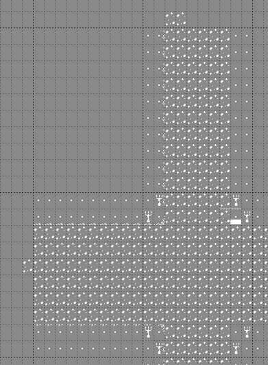
However, I still needed to know how to lay the tiles. That turned out to be a portal into another detour of pointless extravagance instead. It started when I booted up Tiled to experiment. It makes sense: a mockup can be a necessary development tool. I had the goal to create a sense of relatively Victorian-era-looking streets. The ones I researched on the 'net looked to have cobblestone or dirt road tiles surrounded by brick sidewalks, upon which rested the oil lamps that were central to the mechanics of the Leerie. Things went downhill from here.
First cosmetic roadblock: none of my purchased tilesets had those Victorian-era tall street oil lamps. There were plenty of candelabras and braziers, but that was about as close as it got. Furthermore, I encountered difficulties finding tiles that pulled off a reasonable representation of cobblestone roads bordered by brick sidewalks. Of course, I could break out a pixel art app and make some of my own, but this was just the beginning of the cosmetic technical bloat threatening to bury me if I chose poorly.

As of yesterday, I was excited to employ the Oryx Design Labs Ultimate Roguelike tileset. Its dark, Gothic feel offered a lot to Leerie. However, no matter how many times I am seduced by the sheer style of the set, it's always been a difficult one for me to employ. For example:
- The sprites bleed profusely through each other unless I create masking sprites for them.
- You would think they are intended for one Sprite per tile, right? However, they often transition too abruptly without employing additional tile underlays or overlays.
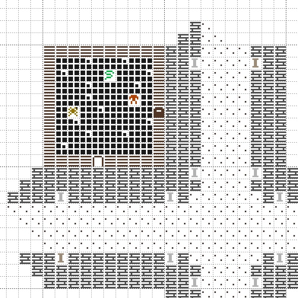
- Even the very walls are enigmatic to fit together, made up of abstract shapes with little contextual clues for their working and no helpful art key provided (the example picture is for a previous version of the set).
Yet, the Ultimate Roguelike Tileset is amazing. Perhaps all the technical bloat is a test to see if I'm worthy of it. Maybe someday. If you feel intimidated by the idea of Oryx Design Labs tilesets, they are usually considerably easier to work with, especially Tiny Dungeon/Sci-Fi.

After further experimentation in other tilesets, I found that the Kenney-1 Bit Pack tileset worked well enough. However, it also has its share of troubles when importing for Unity. For example, I need to do manual "flipping" for some tiles to work. Also, it's no better at layering than the Ultimate Roguelike tileset (not that I must do that). It's a little over 1000 sprites. That's a lot of content bloat for a simple project! But, with that many options, it's pretty good for prototyping nearly any project, and it's free.
After hours and hours of quibbling on tilesets, I had wasted enough time. I decided to use the Oryx Design Lab's Classical Roguelike tileset specifically because it had a lot fewer cosmetic concerns attached. It's perfect for making a prototype. Of course, it nails that classic ASCII Roguelike aesthetic perfectly.

I think I arrived at the correct answer at the end: forward, ever forward! Not sideways, backward, or waffling between decisions. I'll save my cosmetic concerns for later. For now, I need to get a finished and working game.
But then, I knew this from the start, and it still didn't save me from my insecurities. Here's hoping to get some better sleep tonight and that this will help me commit to the stuff that needs doing.
Get Leerie
Leerie
2022 7DRL Submission about a lamplighter against the universe
| Status | Released |
| Author | geldonyetich |
| Genre | Role Playing |
| Tags | Seven Day Roguelike Challenge |
More posts
- 2022 7DRL Postmorteum PostmorteumMar 14, 2022
- 7DRL Day 7: A Lackluster FinishMar 12, 2022
- 7DRL Day 6: Technically, A GameMar 11, 2022
- 7DRL Day 5: Cleaning Up The StreetsMar 10, 2022
- 7DRL Day 4: ExhaustedMar 09, 2022
- 7DRL Day 3: Baby Steps Into Content GenerationMar 08, 2022
- 7DRL Day 1: Tileset and Theme SettlingMar 06, 2022
Leave a comment
Log in with itch.io to leave a comment.